Basics
HorizontalStackPanel and VerticalStackPanel are containers that lay out children horizontally or vertically in one line or row. The following code lays out 3 widgets in one line:
var horizontalStackPanel = new HorizontalStackPanel
{
  ShowGridLines = true,
  Spacing = 8
};

var textBlock1 = new Label();
textBlock1.Text = "First Text";
horizontalStackPanel.Widgets.Add(textBlock1);

var textButton1 = new Button
{
  Content = new Label
  {
    Text = "Second Button"
  }
};
horizontalStackPanel.Widgets.Add(textButton1);

var check1 = new CheckButton
{
  Content = new Label
  {
    Text = "Third Checkbox"
  }
};
horizontalStackPanel.Widgets.Add(check1);
It is equivalent to the following MML:
<Project>
  <HorizontalStackPanel ShowGridLines="True" Spacing="8">
    <Label Text="First Text" />
    <Button>
      <Label Text="Second Button" />
    </Button>
    <CheckButton>
      <Label Text="Third Checkbox" />
    </CheckButton>
  </HorizontalStackPanel>
</Project>
It would result in the following:
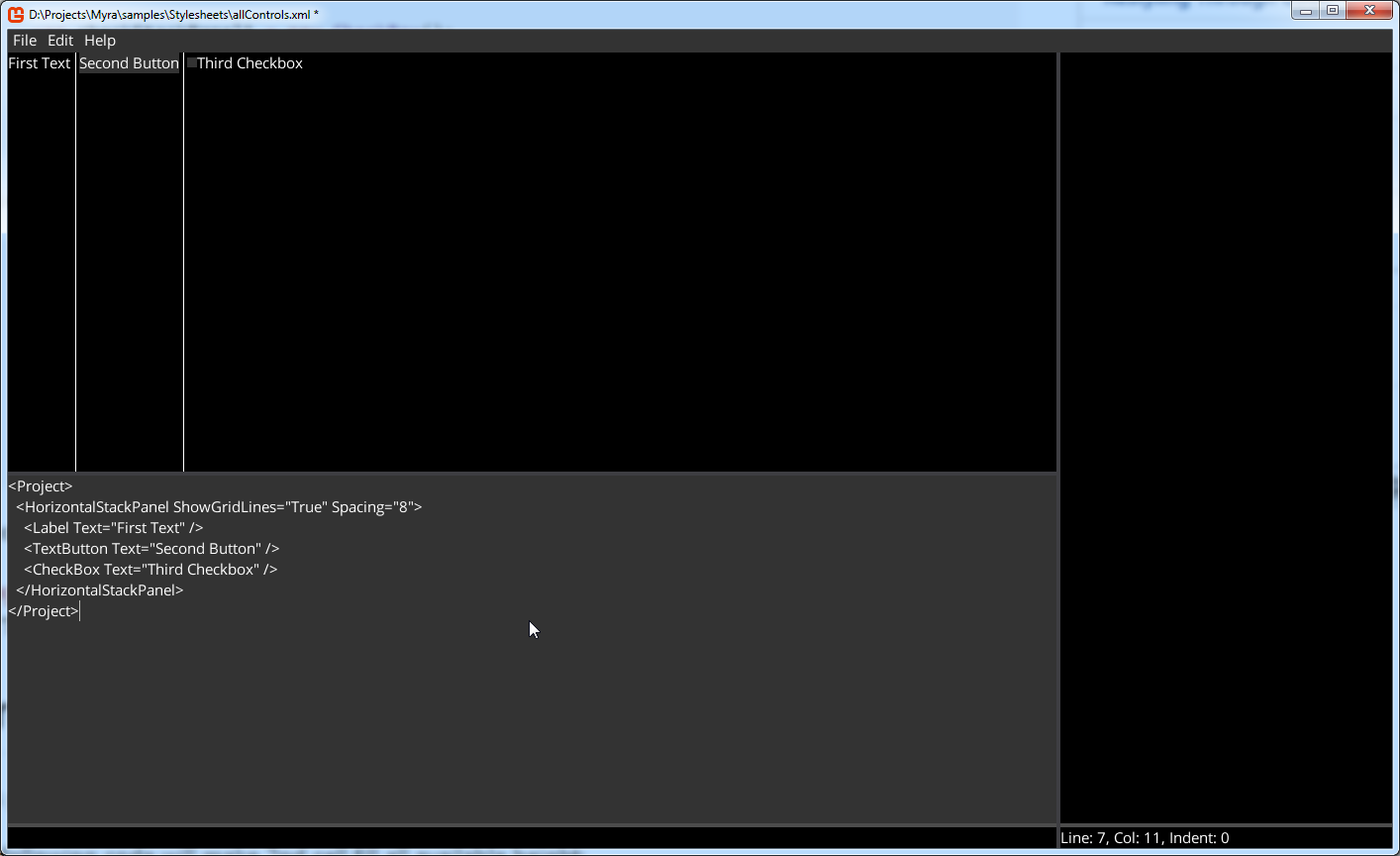
Note. There are white lines separating cells, because "ShowGridLines" is set to "True". It's useful property to debug the StackPanel behavior.
Proportions
It is possible to specify proportions for StackPanel's widgets through the attached properties.
I.e. following code will make 2nd widget fill all available height:
var verticalStackPanel = new VerticalStackPanel
{
  ShowGridLines = true,
  Spacing = 8
};

var textBlock1 = new Label();
textBlock1.Text = "First Text";
verticalStackPanel.Widgets.Add(textBlock1);

var textButton1 = new Button
{
  Content = new Label
  {
    Text = "Second Button"
  }
};
textButton1.VerticalAlignment = VerticalAlignment.Center;
StackPanel.SetProportionType(textButton1, ProportionType.Fill);
verticalStackPanel.Widgets.Add(textButton1);

var checkButton1 = new CheckButton
{
  Content = new Label
  {
    Text = "Third Checkbox"
  }
};
verticalStackPanel.Widgets.Add(checkButton1);
It is equivalent to the following MML:
<Project>
  <VerticalStackPanel ShowGridLines="True" Spacing="8">
    <Label Text="First Text" />
    <Button VerticalAlignment="Center" StackPanel.ProportionType="Fill">
      <Label Text="Second Button" />
    </Button>
    <CheckButton>
      <Label Text="Third Checkbox" />
    </CheckButton>
  </VerticalStackPanel>
</Project>
It would result in the following:
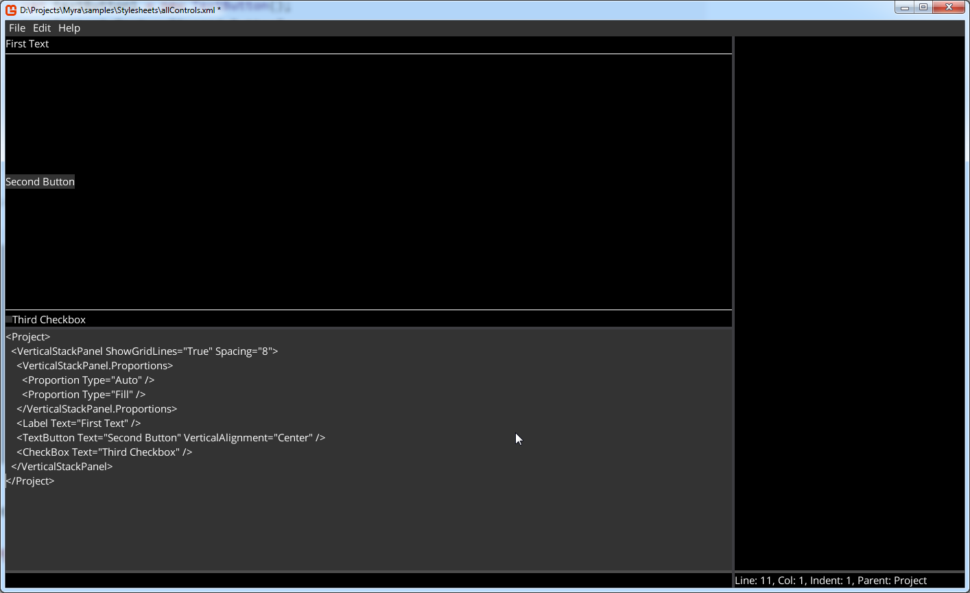
Default Proportions
It is possible to set default value for proportions. I.e.:
  <HorizontalStackPanel ColumnSpacing="8" RowSpacing="8">
      <HorizontalStackPanel.DefaultProportion Type="Auto" />
  </HorizontalStackPanel>