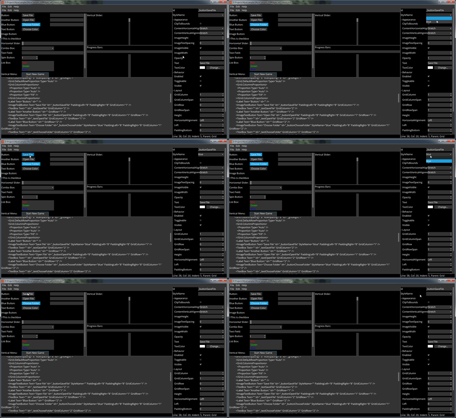
Every widget can have more than one possible style defined in XML.
For example, consider the following fragment from the default stylesheet:
  <ButtonStyles>
    <ButtonStyle Background="button" OverBackground="button-over" PressedBackground="button-down" />
    <ButtonStyle Id="blue" Background="button-blue" OverBackground="button-blue-down" PressedBackground="button-blue-down" />
  </ButtonStyles>
It defines two button styles: the default style (without an ID) and the "blue" style.
To create a button with the default style, simply call its constructor without parameters:
  var button = new TextButton
  {
    Text = "My button"
  };
Or through MML:
<TextButton Text="My button"/>
To create a button with a named style, pass it to the constructor. For example:
  var button = new TextButton("blue")
  {
    Text = "My button"
  };
Or pass it to StyleName property when using MML:
<TextButton StyleName="blue" Text="My button"/>
Note: It's also possible to create a widget without any applied style. To achieve this, pass null to the constructor: var button = new TextButton(null);
MyraPad Support